As an example, consider the naming for the The Richard Desich SMART Commercialization Center at Lorain County Community College (The Desich SMART Center). The Center is marketed outside of the context of the college, so within the hierarchy, it’s more important to associate the name of the Center with the facility. The donor’s name is prominent; yet the equity of the association with the college is not lost – logically, it needs to be third in the hierarchy.
The Role of Progressive Disclosure in Identity Architecture
Brian Sooy • November 12, 2012
Progressive disclosure helps companies create logical parent and component identities that function within a visual identity system.
At some point you may find that your organization needs a component identity system, or what we can call an identity architecture.
At times, a subsidiary, division, program, or even a donor name must appear in relationship with a corporate brand’s logo. This practice is often referred to as co-branding or sub-branding. For now we’ll avoid the word brand and focus instead on the elements as a visual identity architecture to explore the connections between the organization, its portfolio, and the customers or stakeholders.
First, let’s be clear on what brand architecture is:
- Brand architecture is the design of the relationship between a company’s purpose (why it’s in business beyond making money), products (the products or services that create value for customers), and its customers (the people who build the brand and sustain the company).
Next, let’s be clear on what identity architecture is:
- Identity architecture is the design of the relationship between a company’s visual identity (The symbol that represents the company and what it stands for), its portfolio (the products, services, and other systems that create value for the brand and its customers), and its customers (the people who need visual clues to understand the relationships between the company and its portfolio).
In many instances, the key issue is focus: at times, both the logic of a visual identity system and its proper hierarchy and architecture can become lost in the rush to launch and promote a new visual identity without a framework of reference.
To begin, what approach should you embrace – a flexible, modular, or rigid visual identity framework? These approaches could also be labeled dynamic and static.
With most identity systems, we recommend a dynamic, flexible approach – with potential for a modular approach for a house of brands — that references the primary or parent identity.
At this point you may be thinking that a component identity that doesn’t feature the parent as a primary element won’t be allowed by the visual identity standards, and that the end result will be a loss of visual brand equity.
We think most audiences are smarter than that, and when approached from a perspective of progressive disclosure, identity architecture is quite logical. Perhaps it’s time to bend (or even break, or revise) common practices as your company grows and evolves.
Progressive Disclosure
The approach we’ve found to be the most flexible in a dynamic corporate, college, or university environment involves the principle of progressive disclosure .
Typically, progressive disclosure is about interaction design: designing the connections and revealing the information an individual needs during a given interaction/experience as they move from the abstract to the specific. Progressive disclosure guides the user through the interaction by managing the information and options that are available at a given time.
Progressive disclosure is a purposeful, people-friendly approach. It’s typically applied to user interface and user experience design (UI and UX) and the methodology can also be applied to way finding and identity architecture.
Every detail of information about a destination does not need to be on a sign; more information about the specific destination can be revealed as a visitor approaches the destination. For our purpose, it also applies to creating a visual identity framework. We can call it name finding.
When applied to name finding, the primary brand’s role is either abstract or specific, depending on the context and the objectives of the communications.
(OK, I realize that this is getting… out there. But stick with me. We’ll bring it home)
Typically, the primary, or parent visual identity has a strong set of guidelines governing its usage. But what happens when you need to add the name of a school of business, the name of a program, or the division of a company to create a flexible and modular architectural system that can be customized with a framework? How does name finding work outside of the context of the institution?
A simple example
Imagine your company (or an entity within the company, such as an internal or external division) as a destination, and the identity system as the name (way) finding for guiding the audience to that destination.
Within the company, the learning centers, divisions, programs, and other entities exist within the company context – so it’s not always necessary to remind people that they are in that specific context. Remember, your audience is smart. They know where they are. It’s not always necessary for every visual identity interaction to tell the entire story about the company, or to be a complete experience of the company. The destination can be revealed according to a hierarchy.
Proximity and context are essential in establishing hierarchies; consider this scenario: A university has created a center for study or research, named after a donor, located in a specific part of campus – say a tech or business park. For the naming rights, the donor has made a significant investment – $15 million dollars.
How would you prioritize the naming hierarchy? Following your visual identity framework, most likely the name should appear like this:
New Hope University
The Luke A. Skywalker Center for Advanced Study of MidiChlorians
The donor is going to want his name more or equally prominent with the university name, but your visual standards aren’t designed to allow for that. Are you going to argue with a donor who just contributed $15 million, let alone a Jedi with a light saber?*
Perhaps a more appropriate solution, which does not dilute the equity in the institutional name and honors the donor, would be
The Luke A. Skywalker Center for
Advanced Study of MidiChlorians
New Hope University
The former approach doesn’t adequately honor the donor, or set a precedent for a hierarchy of naming either, let’s consider:
The Luke A. Skywalker
Center for Advanced Study of MidiChlorians
at New Hope University
There. Add the university’s visual logo (similar to the Fisher School of Business at The Ohio State University), and everybody’s happy.
People-friendly identity systems
Consider if your existing visual framework is people-friendly. Think of the naming hierarchy in a similar way you would with a way finding system; in that it is not necessary to give the audience all of the information at every interaction with the system.
Assuming the Center from our example is on the campus of the university, the name-finding approach follows this logic:
- A visitor wants to visit the Center, located in a specific place.
- First they will have to find their way to the campus, then to the building or part of campus where the center is located, then to the center itself.
- A signage system would support that way finding hierarchy; so should the identity architecture system.
Visual references to the Center, outside of campus or in Center-specific communications, will reference the Center as primary and the institution as secondary. The Center is presumed to be the primary focus of those communications, and the secondary affiliation with the institution is sufficient to maintain visual equity.
Once the audience visits the Center, either virtually or in person, the affiliation with the institution becomes primary, and then once again becomes secondary as the visitor moves into the institutional context (abstract) and to the specific of the center.
The audience, in his interaction with the visual identity, moves from specific to abstract to specific. At each point of interaction, the institution is referenced, but it moves from secondary to primary and back to secondary emphasis in component applications.
Why Component Identities are Necessary
Institutions and companies have different reasons for component identities to exist withing their identity architecture. Some may want to market a program or a Center independently of the institution. Internal programs may want their own identity for marketing to specific target audiences.
Visual identities are elements within a brand system that connect a company’s products and services with the people who buy them.
Institutional and corporate marketing tends to be broadly focused. The business case for target marketing is well proven; component identities allow an institution to target specific audiences and maintain awareness of the institution through secondary references. The broader the focus of a marketing initiative, the more it is simply awareness-building or image management. Again, we come back to focus, and its critical role in communications.
In body copy, it will make sense to refer to the center as the SMART Center, or the Desich SMART Center. This is an important aspect of name finding – considering how naming occurs in context – but suffice it to say, it should be very evident how to construct a short reference to a program or other entity.
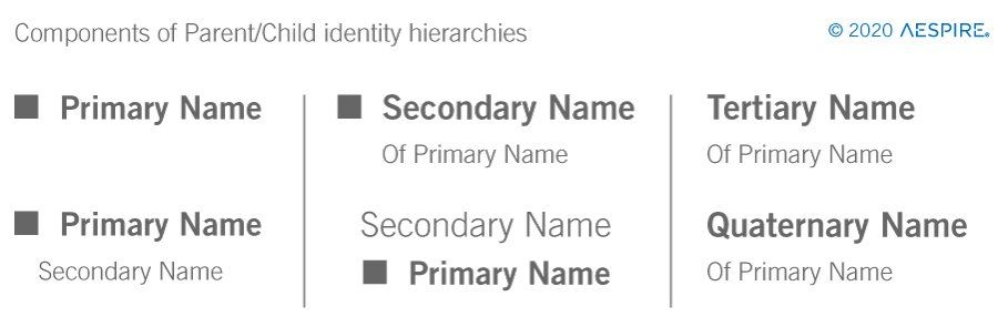
How progressive disclosure applies to identity architecture
- The context, or system, of the brand identity is the organization, corporation, or institution – the parent identity. The primary visual identity framework should feature the parent logo as primary.
- Communications that are division, program, institute, or school-specific may feature the component or co-branded identity, with the organization, corporation, or institution affiliation becoming secondary.
- Programs that operate independently of the parent, but require a clear endorsement and affiliation with the parent institution, will place the emphasis on the program, initiative, center or school. In this instance, the inclusion of the parent logo adjacent to the center name may be the most appropriate and focused solution.
In summary: Progressive disclosure from the furthest point outside of the main context indicates that the component identity should be primary. As the audience draws closer to the organization, the primary identity will move up in the hierarchy, and once again recede as the audience arrives and moves into the context to the division, program, school or initiative.
Since the organization’s name is always clearly identified with the component identity, the audience has a reference to the parent, no matter how far removed out of the campus context they experience the component identity.
As the audience begins to understand more about the division, school, the program or initiative, they are guided to the organization (the parent identity), and having arrived there, the component identity is progressively revealed to guide them to the entity itself.
Some examples of co-branding
If your visual framework is new, you may have been able to plan for these instances. If it’s not, you will need to adapt to them. Either way, the key to successfully managing the extension of the parent identity is consistency. You can’t expect an identity system and the accompanying visual standards to be inflexible and unscalable.
Regardless, an identity system for a corporation, college, or university can be a complex system because of the multiple hierarchies (school, program, division or donor name) and there is not a one-size-fits-all solution.
So where to begin? Perhaps it’s time to add child or component identities; or there is a need for creating a consistent hierarchy for the secondary and tertiary naming conventions.
We’re not saying that our approaches are suitable for your particular institution (but they certainly are for the institutions they were designed for), given the variety of shape, style and size that logos appear in. While these examples may not be completely relevant to your particular situation, perhaps one of these approaches will give you some insight into how to solve your particular challenge.
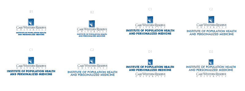
Case Western Reserve University Institute Brand Architecture
At CWRU, institutes are entities formed to aid with fundraising initiatives for high value research. The challenge was to explore co-branded extension options for the main CWRU identity. This approach offered options treating the logo as the primary or secondary element.
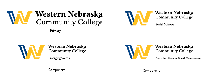
Western Nebraska Community College Brand Architecture
For the most flexibility, horizontal and vertical options are explored in order to provide Western Nebraska Community College with a visual identity framework that is adaptable to any potential application. Component identity applications were developed for programs and named facilities.
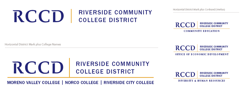
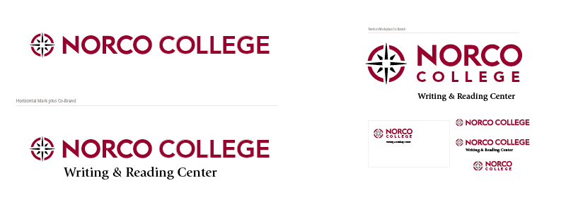
Riverside College District Co-branding
Riverside Community College District and its three colleges (former campuses) each required different approaches for their component identities. Shown are the NORCO College and RCCD identity.
Lorain County Community College Co-branding
The objective of Lorain County Community College’s visual framework is to always reference the parent institution, because of the equity, visibility, and reputation of the institution. Over the years, this has required a diligent and forward-thinking approach to maintain continuity, as the institution evolves. The cornerstone of the identity framework is the LCCC Square mark.
Primary Logo
The primary LCCC Logo is an adaptation of the original script that has been associated with the college since it was founded. The primary mark is a combination of the square and the college name.
Secondary Logo Applications: Foundation
Secondary applications, such as the Lorain County Community College Foundation logo, combine the serif type standard with the primary college logo.
Tertiary Logos : Learning Centers
Because of the equity in the LCCC square and script, tertiary marks, such as these for the LCCC Learning Centers, have been simplified to accommodate center naming. The specific naming is anchored with the LCCC square and contrasting weights of Linotype’s Frutiger, designed by Adrian Frutiger. These particular marks will always appear in context of the primary LCCC logo.
Program Logos
Program logos (or sub-brands) are tied to the primary identity on a case-by-case basis. The logo for LCCC@Work references the primary identity through alignment with a banded variation on the college name and the square.
In instances where a program is going to have a regional or national presence, the college identity is included in name only, and may at times coexist with a donor’s name.
Most often, these logos are seen outside of the context of the college’s institutional marketing, and the campus. For these programs, the main emphasis is on the program; maintaining continuity with the equity of the brand means that a text reference is appropriate.
The best logo formats for professional results
Consistency matters
Regardless of how deep a visual identity hierarchy must reach, the key is consistency. Your organization’s identity is living, so it must be dynamic.
*Donors and names of historical figures referenced in this article are for demonstration purposes only, and may be trademarked by George Lucas and Disney. No evidence exists in the Star Wars canon for any such Center or University and references to any characters, fictional or living, are purely coincidental. Or are they?
Do you have a hard time explaining what your company does or why your brand matters to people?
If you struggle to grow your business, you’re not alone. Aespire can help you create a clear message and brand that helps you grow your business. Contact us today for a consultation with a StoryBrand Certified Marketing Guide.
Get a Free Comprehensive Marketing Assessment
Stop hoping your marketing will sort itself out.
- Complete this free assessment in 15 minutes.
- Review your custom report (and schedule a 30-minute review) to diagnose what’s happening.
- Create an action plan to get your marketing back on track.
Technology changes, styles evolve. Have the courage to reinvent yourself. None of us gets from where we were to where we are without building upon those whose work and thinking we admire.

Consistent, strategic brand investments can create sustainable advantages over time for independent businesses competing against larger, well-funded competitors.
In this episode of the Everybody Brands Podcast, Brian Sooy and guest Zach Hoskins discuss Zach's perspective on sales.