Custom Font for the New Living Translation Bible
A custom typeface enables Tyndale to reduce their page count by 10% in one of the world’s most popular Bible translations and improve readability for all ages.
Tyndale House Publishers, one of the foremost Bible publishers in the United States, had a problem. In addition to rising ink, paper and other printing costs, adding study notes in the New Living Translation, Second Edition, would increase the page count. And, unlike other publishers, they could not go back to the author and ask to have text cut. Deleting even one word from the Bible was out of the question!
How a custom typeface design makes the Bible more readable
I was especially jazzed with the way the new One Year Bible turned out — a 10% longer text in a stronger typeface — yielding the same page count! To think we competed with Century OS and Weidemann — and I think — won.”
Timothy Botts, Senior Art Director
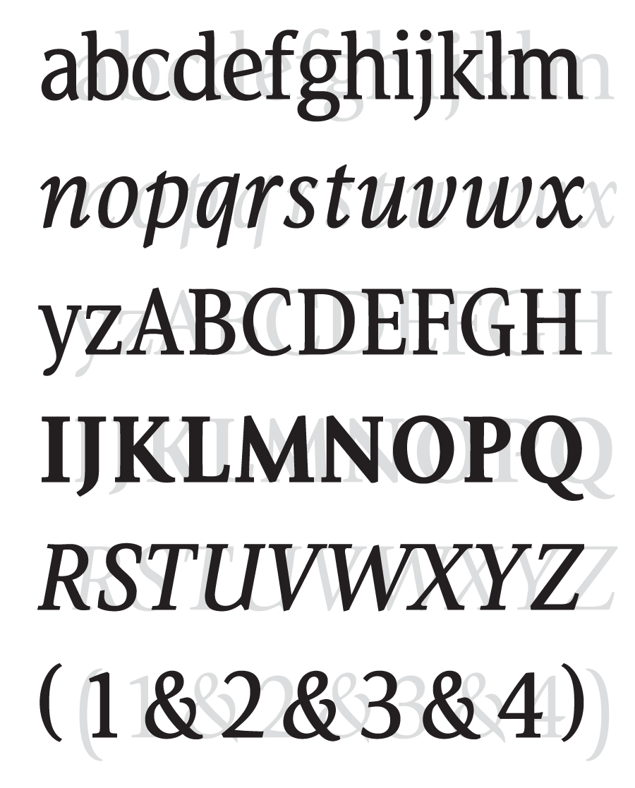
Lucerna compared to ITC Giovanni
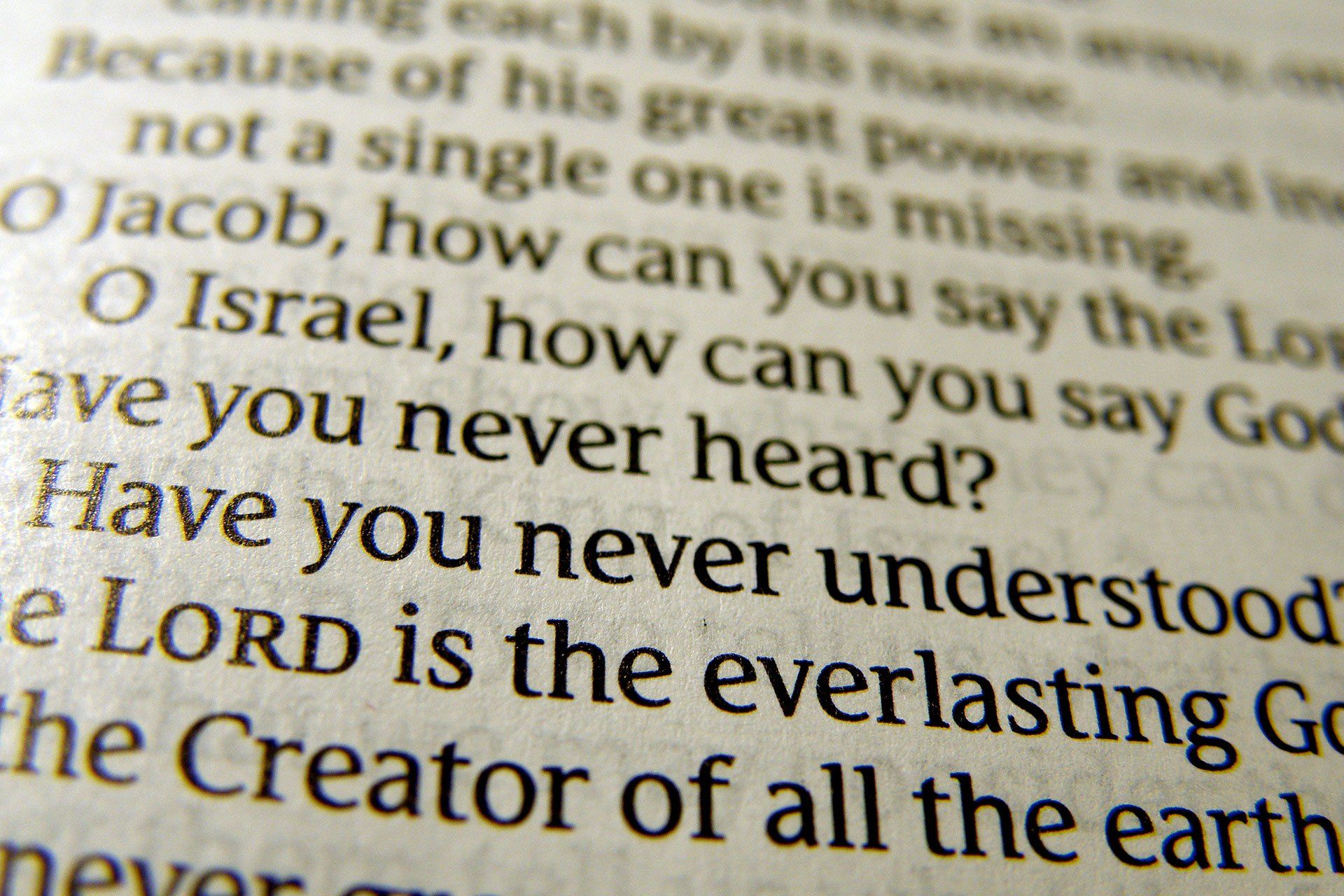
Detail of Lucerna Custom Bible Font
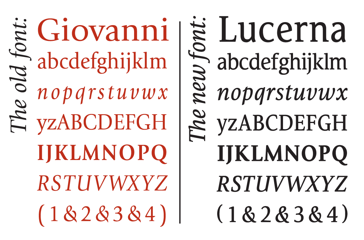
Lucerna compared to ITC Giovanni
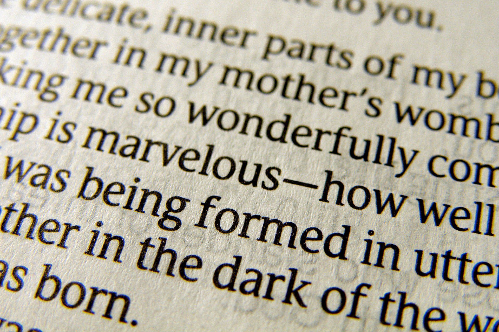
Detail of Lucerna Custom Bible Font
The Business Case
The Challenge: Design a New Font to Make the Holy Bible More Readable
Each aspect of the printing process was examined before Tyndale settled on a solution that was, at first, not obvious. What about the typeface? Was it possible that a new font could help contain costs? Surely one of the thousands of available typefaces would be suitable. After all, fitting more words on the page would result in savings on ink and paper. But, would a smaller font still retain, even improve, readability? Was the right font out there?
Their search for an answer to this question led them to Brian Sooy, principal designer for Altered Ego Fonts, a division of Aespire.
From practical and economic needs, the typeface Lucerna was created. Lucerna enabled Tyndale to reduce the page count in the New Living Translation Bible by 10% in one of the world’s best-selling Bible translations and improved readability for all ages.
Brand Strategy:
Why did Tyndale Choose Aespire to design a new Bible typeface?
After Tyndale originally approached Robert Slimbach (of Adobe), who was not available due to commitments to existing projects, Brian Sooy of Aespire was Tyndale's next choice.
In 1995, Altered Ego Fonts released Veritas ( Latin for Truth ), a font designed with Bibles and publications in mind, as the narrow columns don't lend themselves to readability due to the small number of words per line. Veritas was designed as a narrow-width font, (not condensed) to aid legibility.
Many years ago, Brian Sooy was introduced to Timothy R. Botts, a world-renowned calligrapher. Tim was also Sr. Art Director at Tyndale, so after some time we discussed the Bible font Veritas, suggesting that it would be useful for making the Bible more readable. Eventually, Tyndale used Veritas in two editions of the New Living Translation.
During the course of many conversations, Brian mentioned to Tim a number of times that it would make sense for Tyndale to have a custom font for their New Living Translation (The first edition was completed in 1996). This version was translated with the goal of making it easy to read and understand while being faithful and accurate to the original biblical texts.
In August 2002, one of Tim’s associates contacted me to explore whether we had an existing font that could be used for their technical requirements. Other options we discussed were customizing a font or starting from scratch.
The most practical solution was to start with an existing font, and Veritas was the choice. The final font bears little similarity to Veritas, but the groundwork had been laid.
Outcomes:
The Typographic Solution to Design and Branding Challenges
Like any design project, this one had a brief with some technical criteria, to help define and solve the design problem.
- Achieve a better character count (to maximize space and ultimately save paper).
- Eliminate artificial condensing of standard fonts (such as ITC Giovanni).
- Have visual similarities to ITC Giovanni, by Robert Slimbach.
- Make the font “stronger.”
- Achieve as good as or better character count than ITC Weidemann or Century Old Style.
- Achieve better character count while maintaining readability.
Enjoyed by Millions of Daily Readers
Consistent Top-Selling Bible Translation
10% More Efficient Saves Money & Paper
Influencing Bible Readers and Bible Design for Generations
Articles and Reference
- Step into Design Magazine: Two Views on Typographic Legibility (Unpublished)
- Inside Business: Divine Design
- Information Design Handbook: Featured Case Study
- New Living Translation Sample Pages
- Biblical Typography: Brian Sooy’s Contribution to the History of the Printed Bible
- More information about the Lucerna Bible Font at Altered Ego Fonts.
Blogs and Reviews
- Guy Kawasaki: Another Font Story
- Bible Buying Guide Large Print Bible Review
- Evangelical Bible discussion on Facebook: "This typeface is EXTREMELY easy on the eyes"
- Curious Obsessions Blog article
- NLT Blog: What makes a "Large Print" Bible? (Out of Print)
- Picking the Font: A Case Study
- Amazon UK reader reviews
- Bible Design Blog: Tyndale Select NLT
- How Design: Font Designs by Brian Sooy (HOW is out of print)
- Amazon Review: “Very easy to read”
“The Lucerna Bible typeface is beautiful in the NLT Study Bible.”
“Much of any review will be subjective. Perhaps that is especially so regarding typeface. The typeface used is Lucerna which was ‘designed by Aespire exclusively for Tyndale House Publishers, Inc.’ The Lucerna typeface is beautiful in the NLT Study Bible. It looks nice in my Slimline Reference Edition but with the larger font size in the Study Bible the typeface becomes all the more beautiful. The combination of typeface and size makes for a reading experience that is comfortable to my eyes.” – Stan McCullars